An amazing collection of current photography news and blogs. The articles are cutting edge. This is a great way to stay up to date on on photography.
http://thephotographypost.com/
Wednesday, October 27, 2010
Thursday, October 21, 2010
The Graphic Design Field: A Shaky Sieve
One thing I am interested in is the career of graphic design. Although there are both generalists (who take a wide variety of jobs) and specialists (who often take a niche a la typography, web design, print media, etc) there are an increasing amount of people interested in graphic design. It is a trendy profession with a lot of people not realizing the cutthroat nature of graphic design.
The fact the field of graphic design may so be, or already is oversaturated with too many designers. Although stronger designers are generally more successful the gap between professional design and novice design is closing. Professional designers have to continue to separate their work from the rest of the design bandwagon. Programs are becoming easier to learn and more automatic functions are being added. Typography used to be available exclusively to those who devoted their life to the art. Currently, with widely available programs like Fontlab, almost anyone can create a typeface. Seasoned designers need to publish strong typefaces that set themselves apart from the multitude other similar edited fonts. In the same way, many people have access to Adobe Photoshop (and simple programs like Picnik with ~2,179,724 monthly active users) plenty of people can spew out high contrast photos, arrange text, and add soft glow layers. All this isn't negative, but it does smudge the lines between 'cool' and good, solid design.
Perhaps this increase in misguided graphic beeliners will be beneficial by introducing more people to the field of design. At the same time, it will very likely provide people with a false sense of "artistic talent" and make it harder for society to identify strong, professional design. What do you think?
Monday, October 18, 2010
Fontstruct
Just a little interesting online site to build fonts. No, your not going to be creating anything amazing on here (get fontlab for that), but it is pretty cool to build experimental typefaces. The user interface is very intuitive and efficient, plus you can save and export your progress. It's based off of a scalable grid system with different angles you can place in each pixel. Fun to mess around with.
http://fontstruct.fontshop.com/
http://fontstruct.fontshop.com/
Thursday, October 14, 2010
Some Awesome Free Typography Fonts
Here are some pretty sweet type fonts that are completely free for download. I've selected them simply because you can use them personally and commercially without having the contact the author. Great for typography design. Check them out!
Lot Free - http://fontfabric.com/lot-free-font/
Cube Font - http://fontfabric.com/cube-font/
Facet Font - http://fontfabric.com/facet-font/
Cube2 Font - http://fontfabric.com/cube-02-font/
Here's a copy of the license pertaining to the fonts. It's very straightforward. Basically, don't edit or sell these fonts, but you can use them in virtually anything else. http://fontfabric.com/downloadfont/FFF_EULA_license.pdf
These are also font list sites you might want to check out:
http://www.fontsquirrel.com/
http://www.ultimatefontdownload.com/index.htm?hop=typodermic
http://www.1001freefonts.com/
http://simplythebest.net/fonts/
Wednesday, October 13, 2010
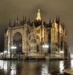
On HDR Photography
HDR, or high dynamic range is a current trend (as of 2010) in photography utilizing multiple images with different exposures. The images are then tonemapped and combined. The process of tonemapping brings blown out light spots back down with information from the lower exposure shots. At the same time, completely dark black areas regain detail from lighter, high exposure shots. The result is an image with darkest and lightest details from every photograph. Although typically three images are taken, the best HDR photographers use more exposure shots. The more exposure shots there are, the less data is in limbo, decreasing how much the program has to guess at colors and tone. When well done, HDR photgraphy is amazing. Check out some good HDR photography here.
Despite all these amazing shots, there are many drawbacks. First off, since the images are overlayed on top of each other, they all must be the same, or ghosting will appear during the tonemapping process, ruining the final HDR. This makes it harder to shoot objects in motion. Also, the tonemapper program (usually Photomatrix or Adobe Photoshop CS5+) must define what lights and darks to include. This process utilizes edge detection, similar to the recovery option in the CS5 RAW darkroom. This causes halos which can quickly ruin your image. Beginner HDR photographers also have the tendency to over do the tonemapping, quite frankly ruining the photo. Some of the worst photography i've seen is HDR photography. Check out a poor HDR shot.
HDR is still in development and much of the tonemapping/editing is experimental. We are likely to see advances in HDR photography as programs get more powerful. As for now, the best we can do is control our images with RAW files, edit out halos with original image overlays, apply meticulous edits, and tread carefully making sure not to over do the tonemapping.
Tuesday, October 12, 2010
Amazing Digital Photomanipulations
I can only drool at the sheer skill, planning and talent that went into these. Enough said.
Check It Out ->!
Check It Out ->!
Tom Gauld
Check out this guys design portfolio, he's got some pretty sweet illustrations and humorous cartoons as well as solid design work.
http://www.tomgauld.com/index.php
http://www.tomgauld.com/index.php
Monday, October 11, 2010
Digital Illustration
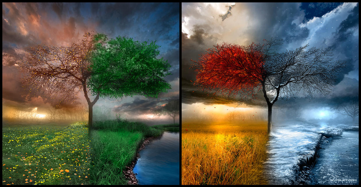
This print remains to be one of my favorite digital art illustrations of all time. The colors are incredibly vibrant and the different textures merge white still creating a flowing picture. There are plenty of textural details from the frozen water to the sun beam in the back. The center composition of leave-filled trees ensures balance. It would have been interesting to see a single image with all four seasons woven seamlessly throughout though. This is incredibly popular on deviant art, and rightfully so. A classic example of digital illustration. Check out the artist.
http://browse.deviantart.com/?order=9#/d15deeg
Sunday, October 10, 2010
Starting Out
So after instruction from a respected professor, I was suggested to this site: http://www.logodesignlove.com. The site suggested to create a blog as well as being active on social networking sites. I was lacking in the former, so this is a step in that direction.
Subscribe to:
Posts (Atom)